Bloom
BRANDING, PUBLICATION
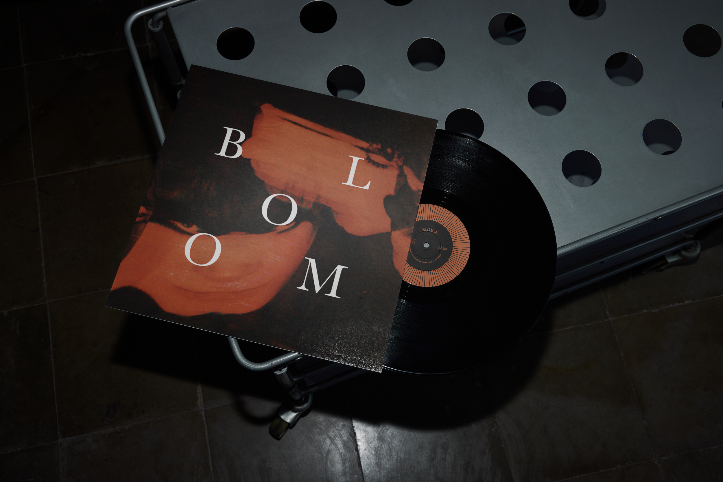
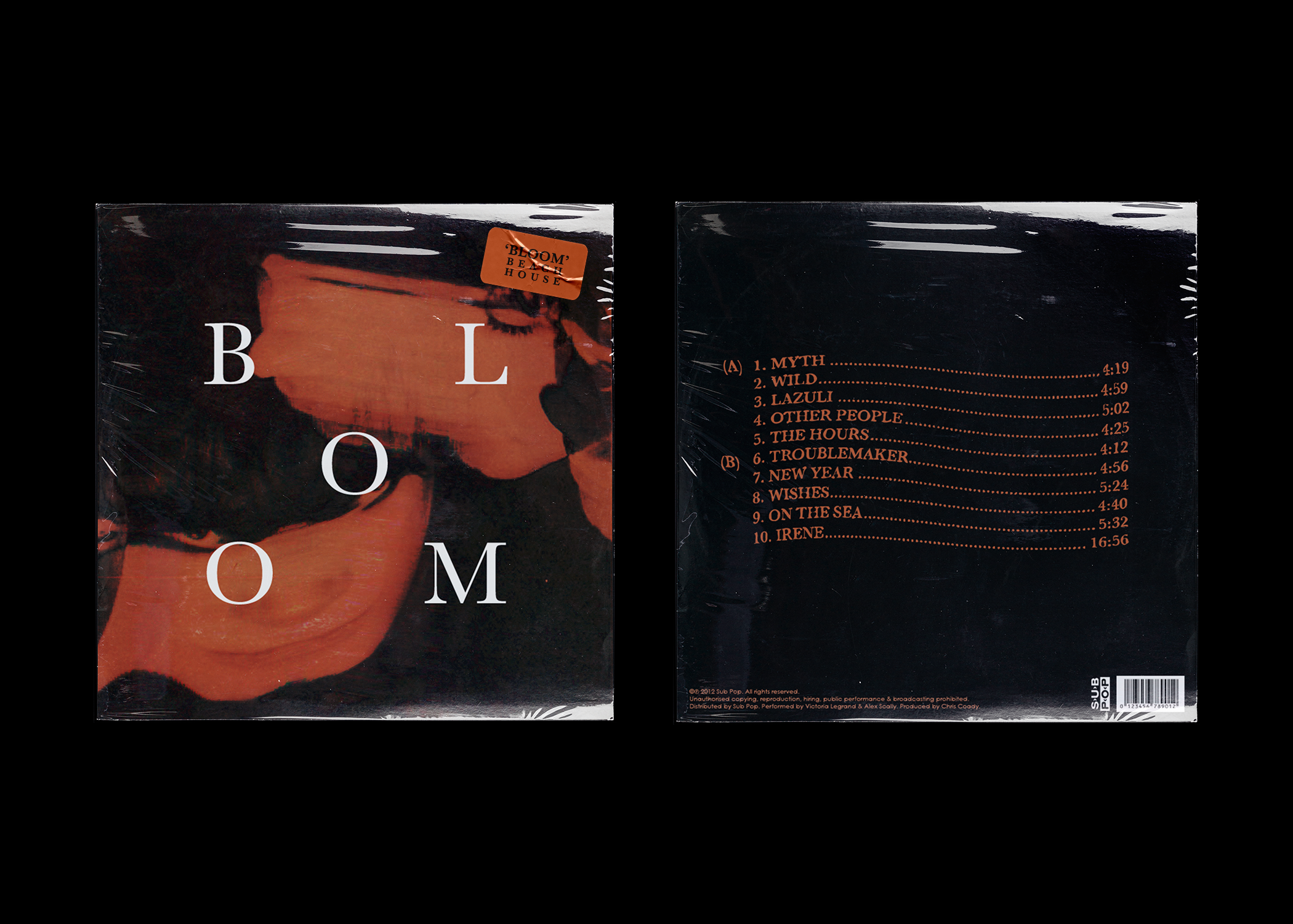
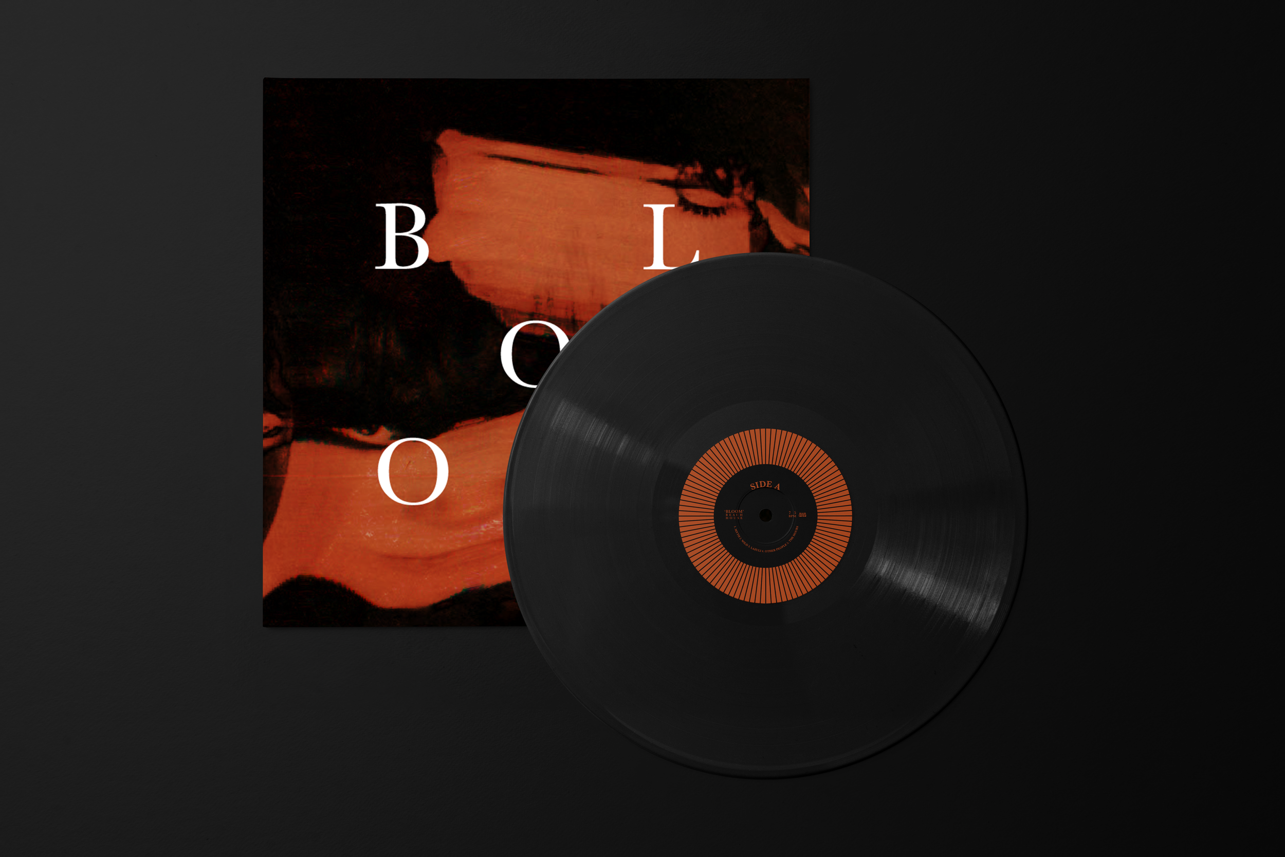
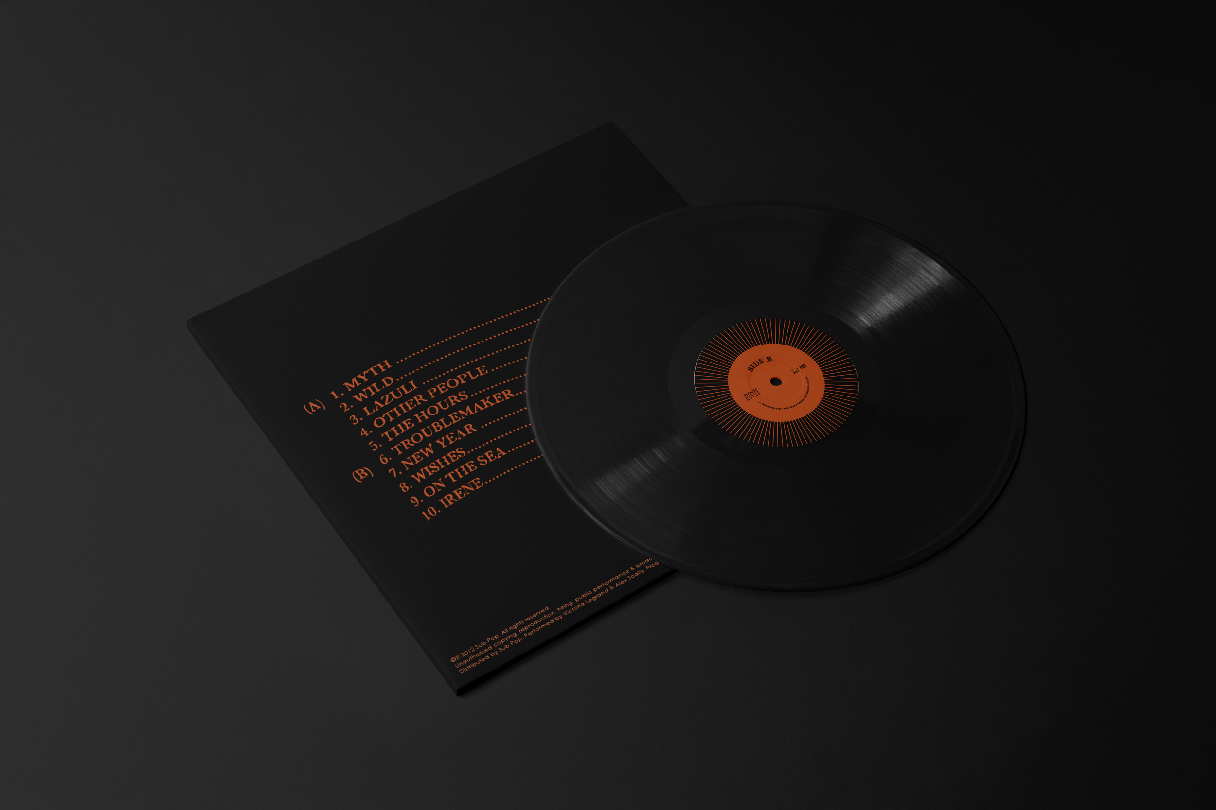
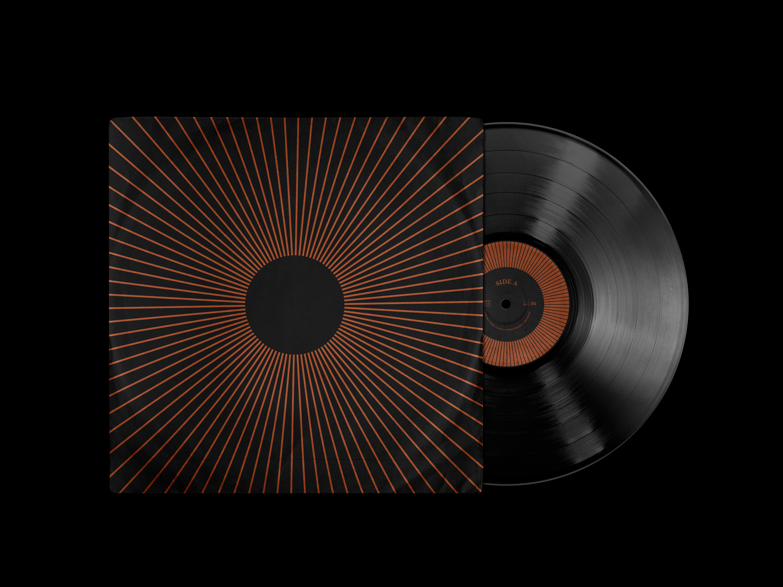
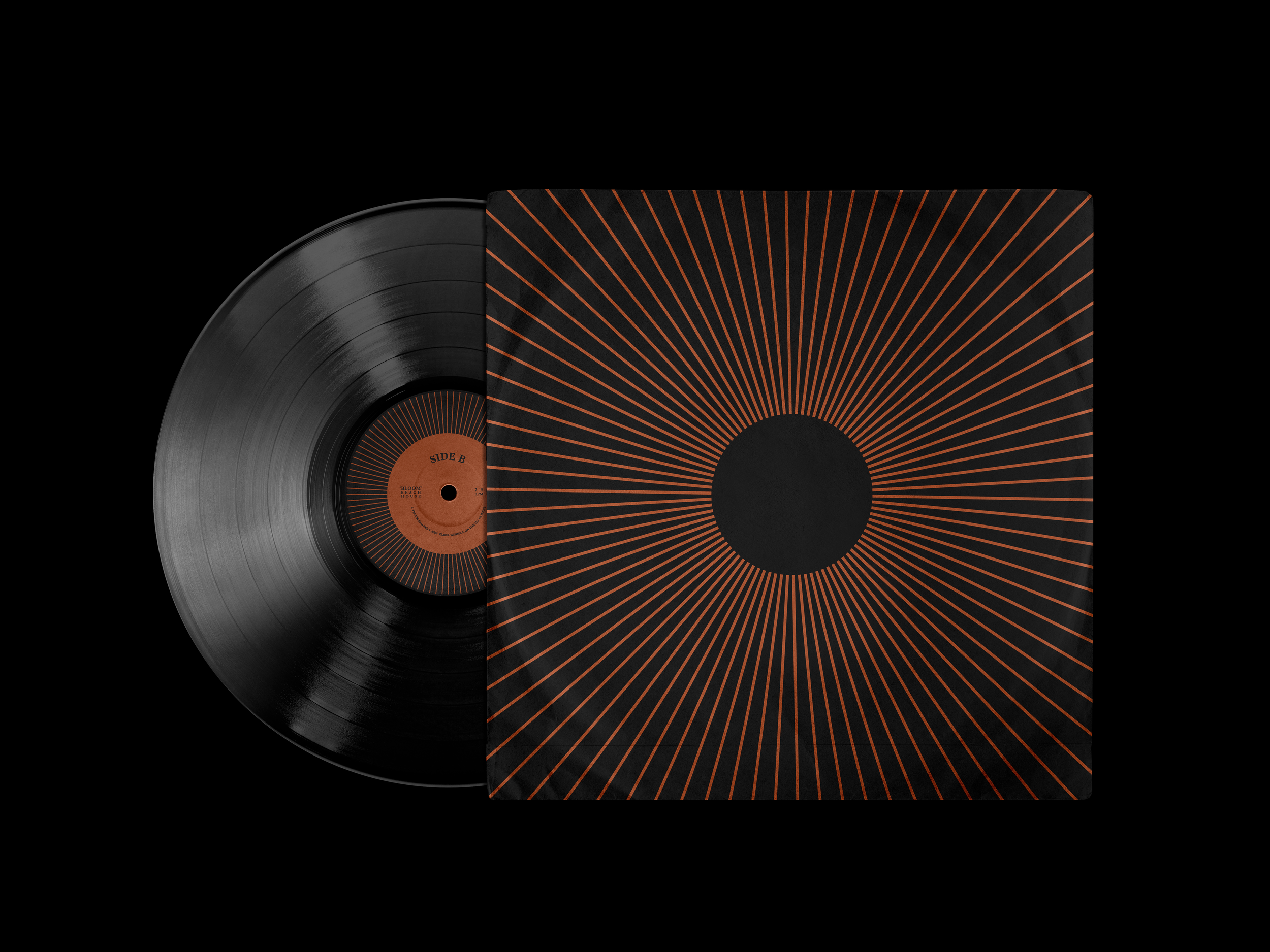
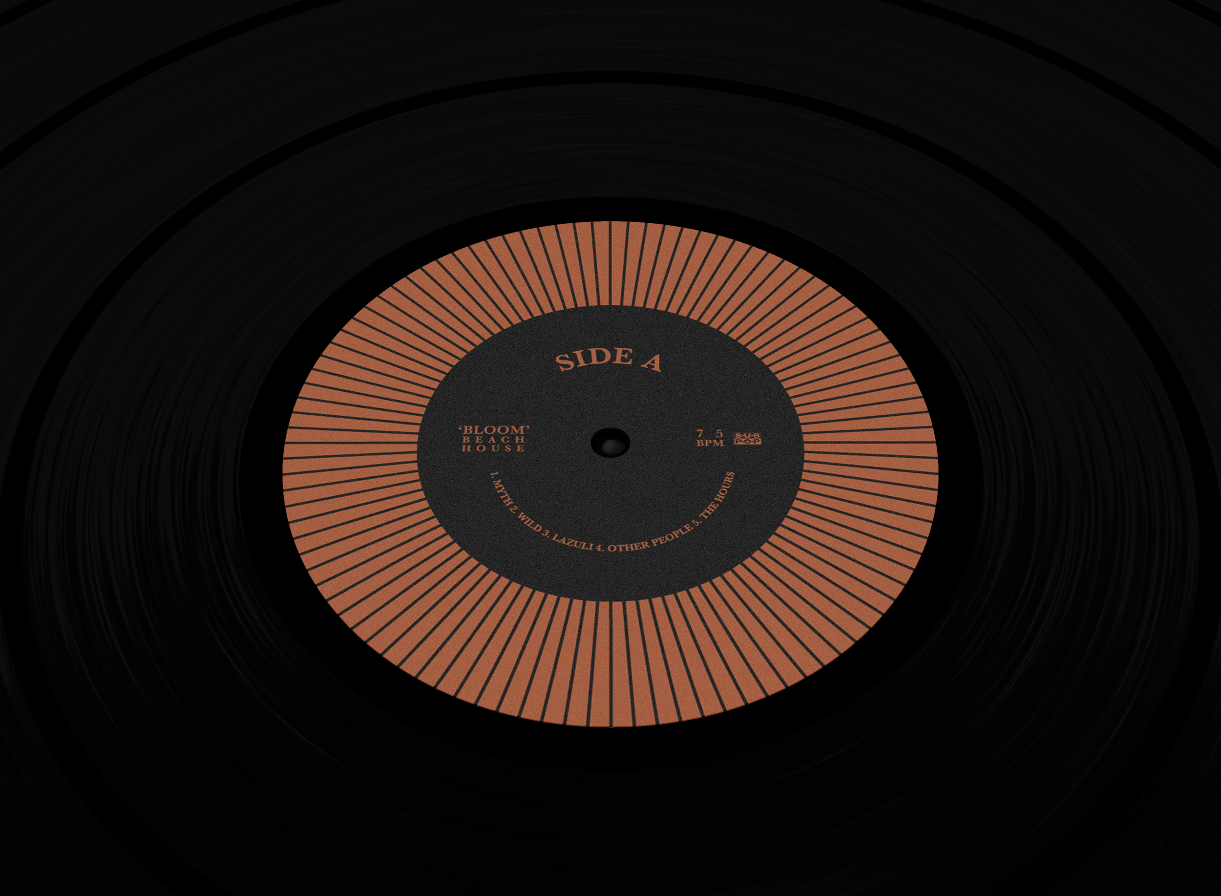
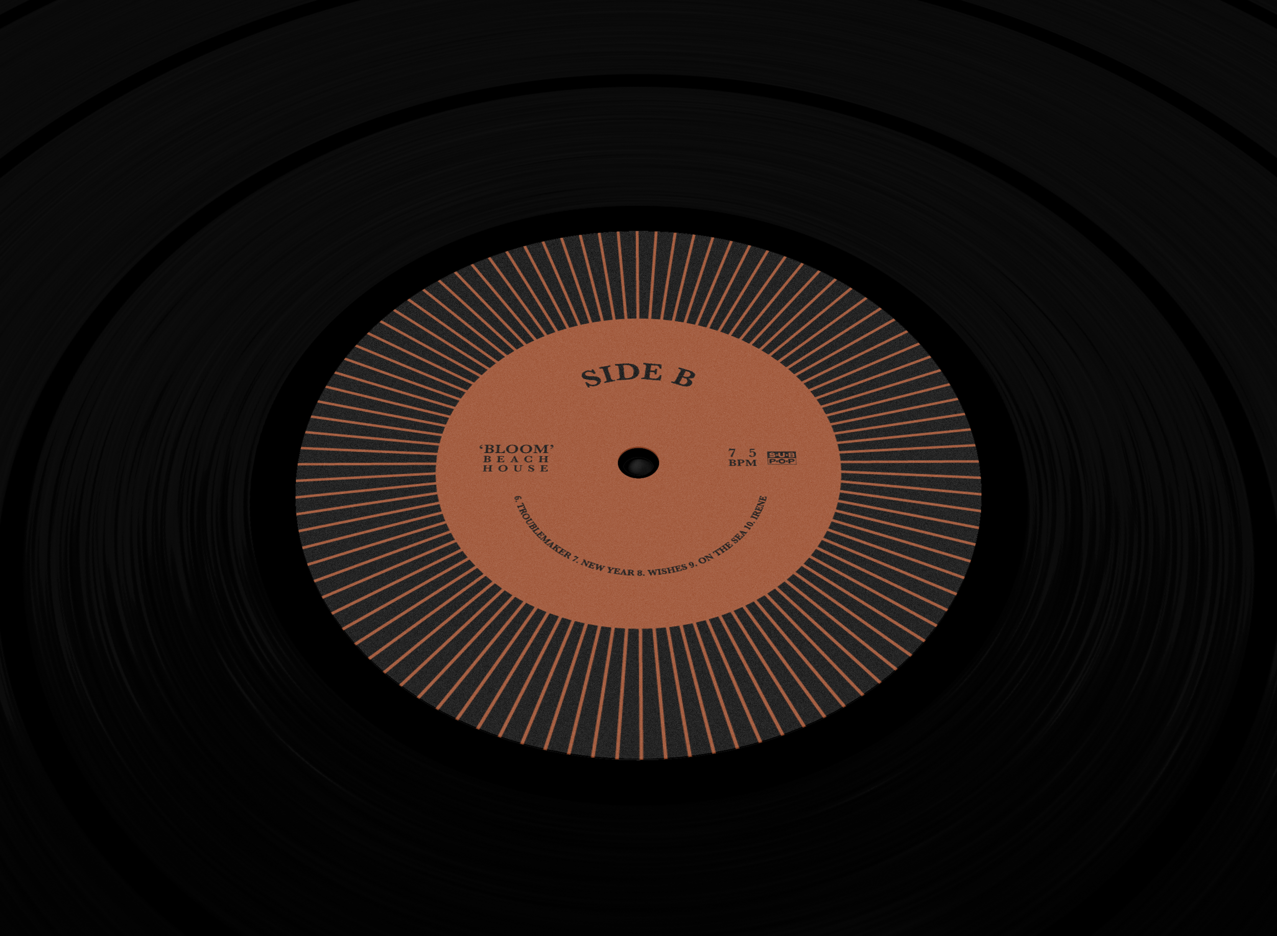
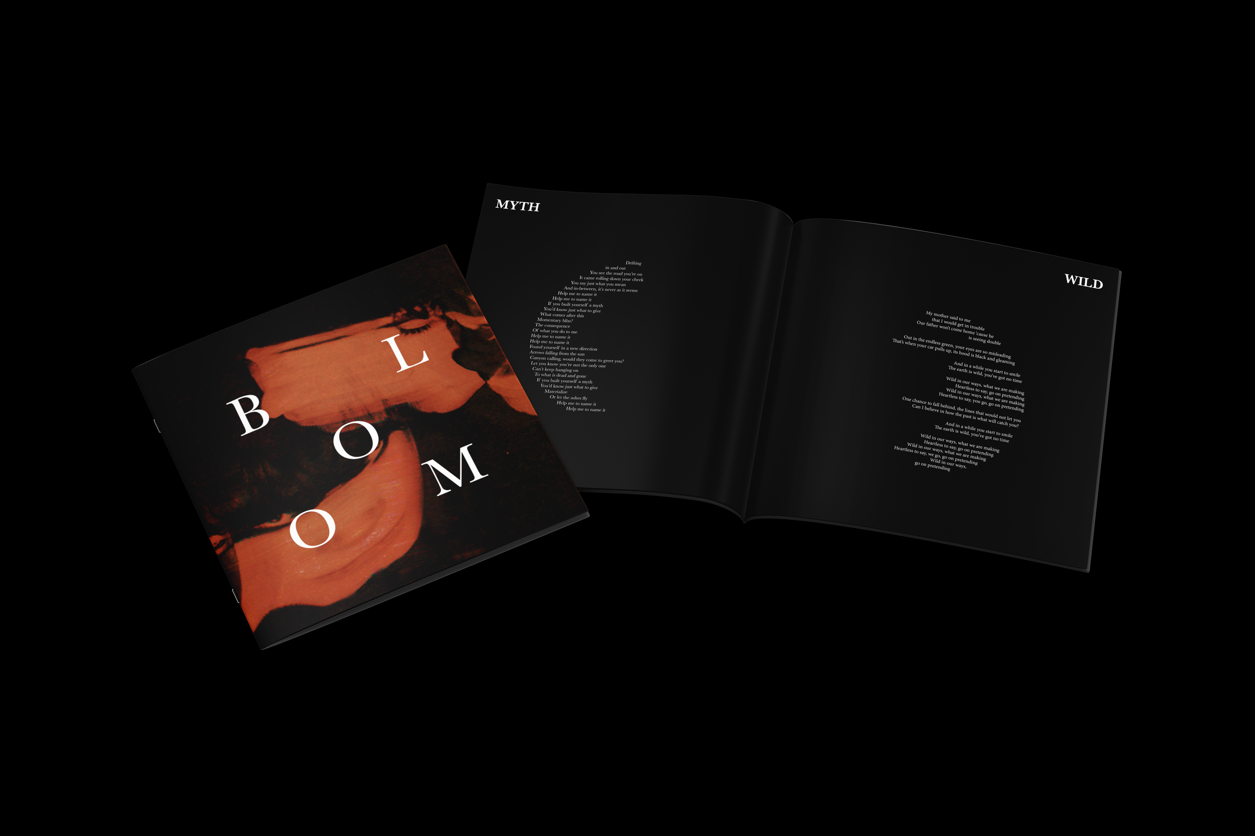
This visual redesign for 'Bloom (2012)' by Beach House captures the album’s dream-pop atmosphere through soft, ethereal imagery and a muted yet luminous colour palette that reflects its immersive sound.
The minimal black and orange colour palette builds contrast and mood. Black reflects the album’s deeper, introspective quality while the orange provides a warmth that reflects the comforting nature of the album. The minimal typeface allows the imagery to be the key focus, yet the rhythmic composition works to demonstrate the album’s flowing energy.
These characteristics allow the design to function as a visual interpretation of the music, transforming its sound and emotional character into a tangible form.